
Throughout the 20th century, the best part of the mass market Chinese fountain pens is those with streamlined bodies. And as a useful note here, the majority of those pens are the descendants of the American best-sellers.
In the realm of fountain pens, to mimic other brand’s successful design has long being a common practice for manufacturers, the Chinese pen makers may have enjoyed a unproportioned long era of making knockoffs. Even now, many of them are dedicated making the replicas, both vintage models or contemporary ones. But my main issue with them is less about referring successful designs, but more about their lack of intention to do more with the portfolio, to push the level of perfection and innovation higher.
Thus, unsurprisingly, when I was first encountered by the moonman M1 during my summer vacation last month, I was enamored.
The Product
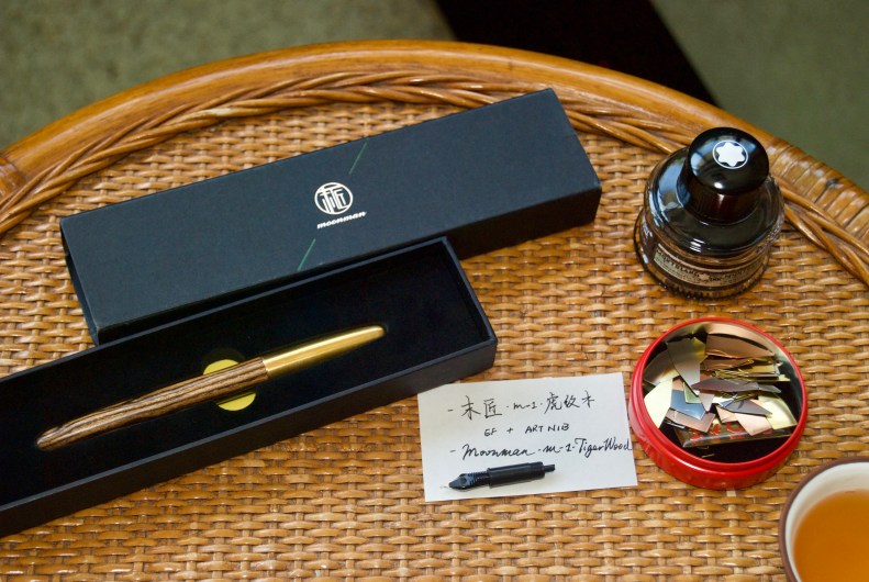
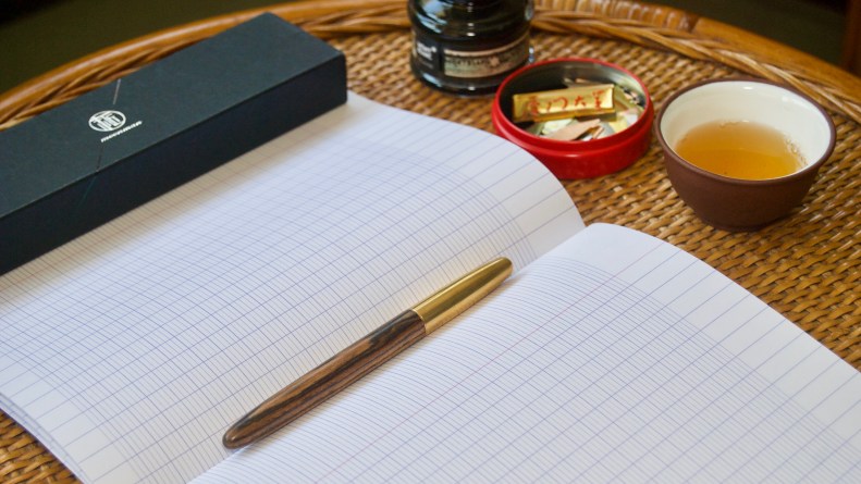
The M1 is a pen recently launched by Shanghai Jingdian, one of the most famous professional Chinese pen sellers and designers on Taobao, under a new brand named moonman. It offers five different wood barrels to choose. The review unit here features a Tiger-wood barrel.
A New Balance
Obviously, without clip, without obtrusive trims, without ostentatious branding, this pen is a perfect and vigorous streamline.
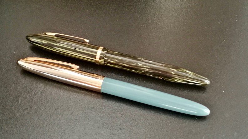
The streamlined shape of a fountain pen, with both head and tail tapered, was first declared by Sheaffer with the Balance in the year 1928, a time when most of the fountain pens on the market was featuring a serious-looking flat top on both ends.
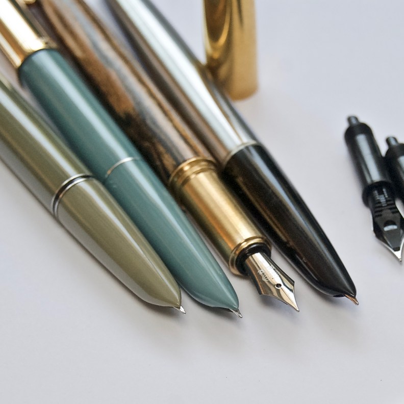
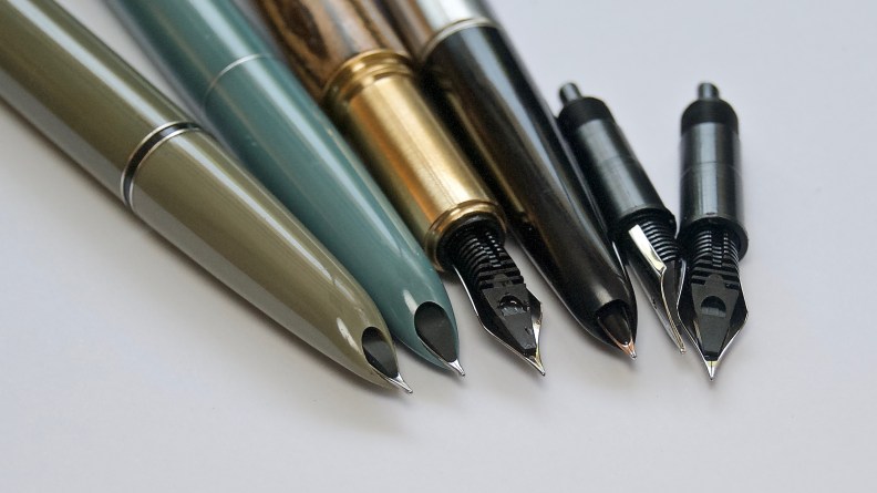
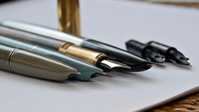
The Balance changed everything. From there, more and more sleek designs such as the Skyline from the Wahl-Eversharp, the 51 from the Parker, were inspired and realized. And by the time the Chinese pen makers got themselves together after the establishment of the PRC, the flat tops were no longer fashionable and to imitate the Parker 51s and Sheaffer Triumphs was the no-brainer. Thus, the streamlined design language ruled the domestic market in China for decades. Among them, you can spot every famous model, such as the Hero 616, 329, 331 and 100, or the Wing Sung 233, 237, and 612. When compare a 90s Hero 329 with a 30s Sheaffer Balance, as in the picture shown here, you can see a clear pattern of inheritance.
But isn’t it a little bit miserable if the Chinese pen makers are still enjoying producing the same products after 50+ years without significant achievement in refining the design? That’s why the tapered shape of this moonman M1 was so valuable and rare: it resonates a lot, but it is already in the next stage of innovation.
Opening the box, you may focus on the contradiction of two vastly different material in the first place: brass v.s. wood—fair enough—but when you pull it out from the slot inside the box, you may find it hard to ignore the shape of those two materials: they are both well curved in the end, making a friction-free torpedo shape. When I first pulled it out, I got quite a feeling of nostalgia build up in my mind.
So I put it side by side with the aforementioned famous models, in the case of this review I choose a combination of Hero 616, 329 and 100, and the reason for my feeling was explained: this shape is the newest result of pursuing the perfect streamline. The wood barrel and metal cap were built with the classic curve in mind while avoiding all the eye-soles such as the ejection hole of plastic, or the little staged caused by the sleeve of the cap, or even the clip. Thus, when closed, this pen features the best textbook streamline I have ever spotted on a fountain pen.


I haven’t seen any efforts put into perfecting the balance-like shape among other Chinese fountain pen manufacturers before, and I am quite inspired by the outcome moonman achieved here. A new balance among all the classic-looking Chinese pens, for sure.
A Great Combination of Material
Wooden pens are notoriously known for its high price and susceptibility to stain, swell, and crack as well. Before this pen, there aren’t too many legit choices to choose from: neither it will break the bank, or you will end up buying some fragile handiwork.
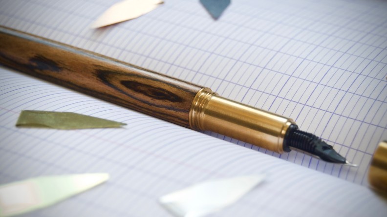
I tried some wood-tuning classes after graduating from college, and I know the streamlined shape in the M1 must be a huge challenge for the factory. First, the decreasing width of the wood demands extra care during both the process of tuning individual product and controlling the overall consistency. Second, the metal thread ring was only inserting to a short distance into the barrel rather than being the inner pipe for the wood to attach to, making the selecting and processing of the wood itself even more crucial.
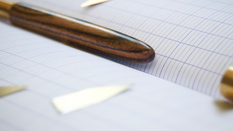
Based on my experience and other buyers’ comments, so far this wooden barrel functions great: besides being good-looking, its light weight brings comfort.

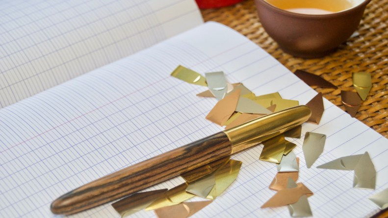
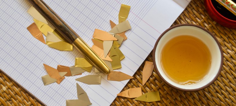
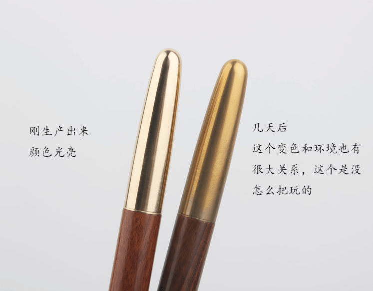
As for the cap and section, moonman boldly opted for the raw brass, for no traditional Chinese pen maker tried this before. But it is a wise decision. I have a Pilot S-20 wood pencil, but I dare not use it cause it annoys me by going moldy since my palm is prone to sweat. By making the section metal, moonman avoids such embarrassing situation. Furthermore, by using raw brass, a material that can take on a unique patina as the days go by, it appeals to the emerging business of getting things ‘personal’.
And don’t forget wood is also a very personal material.
A High-potential Nib Unit
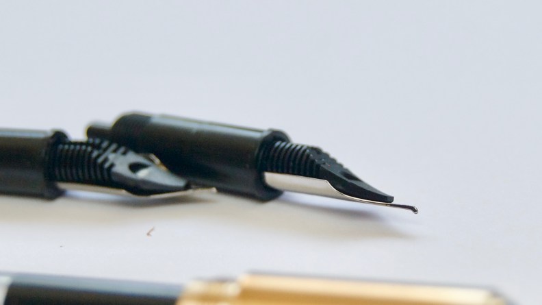
Most Chinese pens are fitting their nibs into the section through friction, while many western brands are using the modular nib unit design to get the nib into the section, such as the Pelikan, and Edison, etc. This situation was broken by the manufacture DELIKE last September with the introduction of the first generation of the New Moon. The moonman M1 here featuring primarily the same filling system from DELIKE.
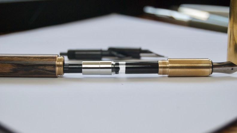

The landing page of this pen describing its filing system is one of the best in China, a claim which I was suspicious of only for a little while. The nib and the feed are fitted inside a plastic sleeve, the same as a Kaweco or an Edison pen, and could be easily twisted in and out from the section. The feed, neatly cut and has sufficient ink channels, looks and works great with the nib. The nib, though simple in pattern, has an excellent grinding style similar to the best grinding from the Golden Age of Chinese Pen, around the early 1990s. Such a grinding is ideal for an Asian student to compile strokes needed for complicated characters.
If you want to write English, I strongly suggest buying a fude nib unit. This fude nib is built on a regular EF nib, by bending its end upward subtly it was meant to write Chinese calligraphy, but due to its similarity with an architect nib, it could handle the English writing. Currently, I am wondering whether the factory could produce a fude nib with a longer end, just like the way Franklin-Christoph creates its fude nibs, to exaggerate the dramatic effect of writing English.
Currently, the EF and the fude nib are the only two nib choices available. If more nib material and width added into the line, this nib unit certainly could be a huge hit in Chinese pen market.
A New Hope
The actual company behind the moonman, the Shanghai Jingdian, has been leading in selling new-old-stock Chinese fountain pens for years. In recent years, I can see a clear pattern that they are moving backward on the value chain by designing new products with OEM vendors.
Before the launching of the brand moonman, Jingdian has been selling the supplementary wooden barrel for the Hero 100 for years, which probably support their decision to make the moonman M1 a wooden pen.


Interestingly, the Chinese name of the moonman means “the last craftsman,” not “the man on the moon.” But give it a second thought, unlike other large online retailers or manufacturers, its focus now is neither trying to leverage the old brand awareness (i.e., the Hero made in Lishui, the Wing Sung made by Green Stationery), or just harnessing from successful western design (i.e., Hero 718, the Jinhao 992).
On the contrary to those practices, what the people behind Jingdian are trying to do is to reiterate the classic design elements of Chinese pen, refresh the filling system and cultivate a new gen of Chinese pen brand. So, maybe moonman is never a shadow name, but an obscure footnote for them to motivate themselves to be better craftsmen while waiting to give it a final moonshot.

