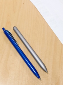
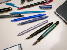
I purchased my first Baron Fig Squire Pen today after a visit to the McNally Jackson Store around the NYU corpus.

I did think about this pen for hundreds of time, especially after seeing the enthusiastic review from Anne and enjoying a extended period of writing with several Retro 51 Tornados, a rollerball that shares basically the same twisting mechanism and refill with the Squire.
But the trigger of buying was not pulled until I touched this pen in person this afternoon in the showroom of the McNally Jackson. It’s plainly cool in hand.

I bought a lot of fountain pens, as well as ballpoints. Among them never lacks a sense of design that speaks modern or minimalist, be it a LAMY 2000, a Moleskin ballpoint, or a Hero 100 Flighter. In the case of the design of the Squire even had a uni-ball which has a extraordinarily similar grip and barrel design as this Squire pen, a Jetstream Prime bought from a Japanese Amazon seller.
But the subtle differentiation in design makes the Squire feel way more impressive that the Jetstream.
For overlaps, both of them are metal pens that feature a ergonomical bulged grip section, a straightforward main barrel, a single color finish and has no exaggerated trim. It was also these overlaps that made me reserved for the Squire, honestly speaking, especially when you consider the price of a Squire is three times of a Jetstream Prime.
But the Squire goes farther in pushing the minimalism design by replacing the push mechanism with a unibody style twist one, getting rid of the clip, as well as the opening slot in the middle of the barrel. The visual improvement of these efforts is huge. Adding to the Squire’s successful design formula is also the better feeling of a well machined and dyed aluminum body, which is lighter, more durable than the lacquered Jetstream’s steel body. I am not joking–one single drop of this Jetstream during my Thanksgiving holiday shattered its lacquer on several spots (which I covered with a blue ink Sharpie).

I tried the Squire out several times tonight and I was reassured that it lives up to all the hyping and appraisals. The 0.6mm Schmidt capless system simply define a flawless line-laying performance, and the feather-weight aluminum body provides a crispy and comfortable handling. And when I finished one session of writing of it and put it down, it stood out instantly among my pens in use. There is nothing to much to say here, you can justify all the trivia behind its hefty price once you try one in your hand.
Even the subtle sword engraving, which was somehow strange to me in the first place, played its role well in reminding me that a pen with a design polished to this level should indeed be a mighty sword.


Thanks for the callout! Glad you enjoyed the pen and thought it a worthwhile purchase :}
LikeLiked by 2 people
Thanks for your review, too!
LikeLike