
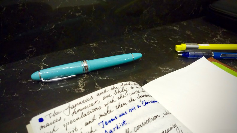
Sailor finally made one of its flagship pens in a vibrant color, which resonates a lot with the proprietary color from Tiffany & Co.’s. This Sailor 1911 Fresca Blue Large fountain pen, with an EF nib, was obtained four weeks ago from the Fountain Pen Hospital, and I am impressed. This pen is my first contemporary Sailor for it did a great job in pulling the trigger in my mind with its unusual blue color. At the same time, Sailor maintains its ability to offer a quality nib along with a perfect level of precision, and it naturally enriches my collection.

–
The first thing I noticed about this pen is its Fresca blue resin which is almost the same as the famous Blue Box. That might sound a little bit wired to be the reason to buy a premium pen from the reputable Japanese brand, but knowing the current line-up of Sailor, this pen is somehow still worth you a second thought.

The modern-day Sailor does roll out some exotic color offerings even before the debut of Fresca Blue, but they could either break my bank (i.e., an Orange King of Pen) or be too slim to be practical (i.e., the Professional Gear Slim Four Seasons). And since I don’t buy in too much for the demonstrator version of Professional Gears or 1911 series, there has been a missing piece here for Sailor in an offering of a vivid-colored large size pen. This time, they got the formula right in making the 1911 Fresca Blue: a vibrant color embodied in a mid-range product that offers a Large size. They did the coloring job so well that it just popped up within all my Instagram feed when Anderson Pens posted this video of swimming pens:
Video courtesy of Anderson Pens
The blue in this pen is named after Fresca, which I still have no idea with its meaning. Personally, I think the reason why Sailor chose this color is quite apparent, and that is saluting to the legendary American Jewelry brand Tiffany & Co. (while seducing its fans at the same time?). The color itself is satiating and appealing. It just eclipses all the standard 1911s. I post a picture of it instantly after buying it, and a friend of mine who herself is a huge fan of Tiffany appraised this Tiffany-like color emphatically. A little personal background here: thanks to all the advertising and marketing courses I have taken during the past years, I am quite familiar with the stories behind Tiffany & Co., and I respect this brand wholeheartedly. So, seeing this pen, all my previous case studies and stories just spring into life.
I know at this point some of the fans of Pelikan may already yell to me about the official Tiffany & Co.’s fountain pen made by Pelikan 27 years ago, the Tiffany Atlas. The M800-based pen obviously is the ultimate writing instrument offered by Tiffany during its history, but the major issue with that pen was the fact it was treated in a way more of an OEM order for a sub-line rather than a partnership between two brilliant brands. Both the M817 and M818 were styled in a business and conservative way, and none of them bears the branding color or a Sterling Silver trim. They are great M800s, but not qualified to be the ambassador for Tiffany & Co. from the pendom. They just lack sensation.
Now is a moment of questioning: as we all know that it is super risky for any products in the states to copy the Tiffany & Co.’s Blue directly, how much room is there left by Sailor between Fresca and Tiffany blue?
Thanks to ThereGoesMinky from Reddit, a direct comparison between them has been made, and it turned out to be Sailor did a reasonable job in approaching Tiffany’s level: They look alike enough to be grouped together, but not identical enough to get Sailor in trouble.
 Picture in courtesy of ThereGoesMinky
With all that, you may understand why I cherish so much about this Sailor 1911. The traditional yet beautiful torpedo-shape of the pen is orchestrating with all the shimmering silver accents and glossy resin in the lovely blue, making it the exact avatar of a Tiffany & Co.’s Setting engagement ring in our Pendom: long-lasting design in impeccable craftsmanship.
=
Talking about craftsmanship, underneath the blue resin, it is still a 1911 series, a series made in honor of Sailor’s founding year. Previously I happened to own the 70s’ Sailor with an EF gold nib which has the words “Golds Form The Swiss Bank” (and some say that that gold could tie into The French Revolution). The whole experience I got from that pen was perfect, thanks to its precise line of writing, the exotic surface treatment, and the incredible durability of its converter and other small components. I love that pen so much that I gave it away to Wayne Wu, who was also quite appreciating its build.
With that experience in mind, I did not feel any uncertain when I was buying this pen. The main body of the pen was cut and assembled in an insanely fitting way. Each time I grab it, it feels just as sturdy as a shuttle made out from hardwood, and each time I posted the cap, it reminds me the standard of the so-called Precision Posting from Franklin-Christoph.
If you have a MontBlanc Meisterstück 146, and if you shake the cap and the main body with a little force, either closed or capped, you will find it wobbles. This would never happen to the Sailor. Besides the fitting between cap and barrel, the precision level of other parts of the Sailor is equally mated to MB’s, if not better than it. Mind you that the later one costs roughly two times more than the Sailor–here we see the hundred-year-old Japanese pen maker undoubtedly achieved something.

This doesn’t mean the design of this pen is better than the Meisterstück 146. The curve of the tail of this 1911 is too steep, clearly less appealing than the MontBlanc’s, and it lacks an existence of branding at the top of the cap at the same time. The biggest issue I am having with this pen is the look of its clip. The clip works perfectly well, and the face of it looks brilliant, representing a style of Sailor’s anchor, but when I rotate the pen and look into the clip in profile, I am feeling uncomfortable. The whole clip is simply a single sheet of thin metal that got stamped into the current shape. The finial of the clip is the ugliest part. I can barely ignore the hole and crack left there when I post or close the pen. I know both Pelikan and MontBlanc also use the same stamping method, but somehow the Sailor’s iteration here is backfiring. You must check in full resolution of the picture below.

The company used a single tone 21-k gold nib* here and ground it to a real EF nib judged by my Asian writing background. Westerners may find the tipping point of the pen as thin as needlepoint, which means less fun, but when writing Chinese characters or Kanji intensively, it works well. Moreover, thanks to sailor’s unique 21-k gold alloy, the nib offers a flexibility which is moderately reactive, quite ideal for me to squeeze notes into the classroom handouts or to make an annotation to my previous notes.

The pen is a cartridge/converter filler using the Sailor’s standard, and Sailor packed this pen with a converter in addition to two cartridges. The cartridges are super easy to use, carrying more ink than the normal international ones, and the converter is built with superior quality, too. Just like what I have said in my Model 66 review, the filling system might be of high weight if you are several days into the pen world and considering to try your next pen. However, believe it or not, once you got your hands dirty on all the major filling systems, one day you would take a whole new perspective toward a c/c system again. I am in line with Brian Goulet** here in defending this system: if you swap your ink a lot or you want a pen which could be easily dismantled and cleaned, c/c is the ultimate answer.


I do love the overall value proposition from this pen. I seldom get intrigued by mid-range Japanese daily writers, unless it is something unique such as a Pilot Capless or 845, but somehow Sailor opted for another routine to make this pen irresistible, thanks to its excellent level of workmanship and the imagine-igniting blue color.
This pen is currently only available in the North America, but I can see no reason why it cannot be popular among the FP/Tiffany lovers somewhere else.May it sail to more continents in the coming days.

*There was a saying among Chinese pen community that this 21-k gold used in a Sailor pen does not meet up to the purity standard of a piece of 21-karat gold, but here in the states I never hear this claim again. If you have any idea behind this anecdote, please feel free to leave a comment.
**See Goulet Q&A Episode 165 at 28:30
