

It has been real torture for me to meet these newest Live in You pens. The international shipment partner of Taobao refused to handle my order due to specific securities concerns. Thus it was not until my spring break did I got the chance to pick up my pen here inside China. However, my hustling here is nothing when compared with the intellectual property maneuvering these lovely designs have caused for the new startup, as revealed in my last interview with Eason Ji, the business owner. The Future series we are having now is a second generation of its original design.
Pens with stories are cool, and now after one week with my Future pens, I can say this brand has stepped up again in the game of producing pens with best visuals and textures, while also keeps a high level of brand integrity. However, the one actual step-up in pen, along with one real flaw, also compromises the whole package and prevents it from being the perfect Live in You pen.
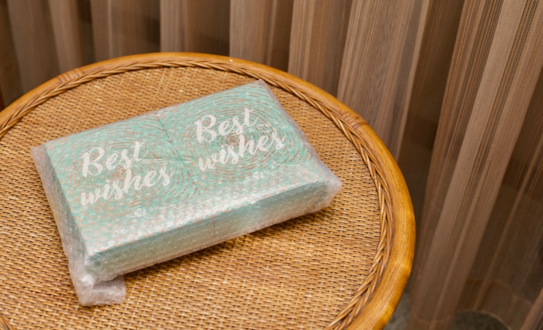
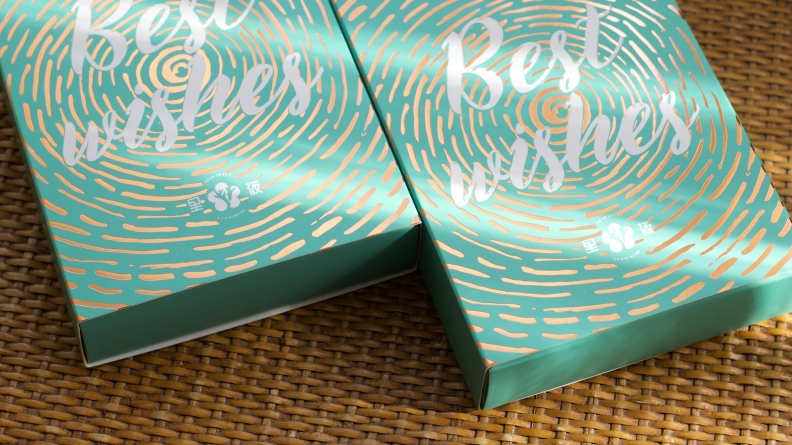
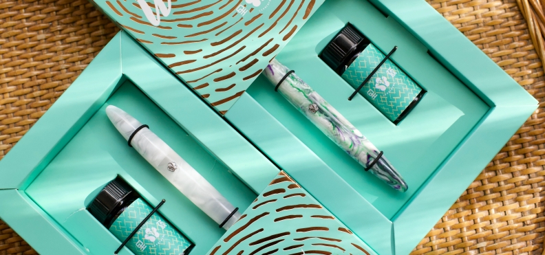
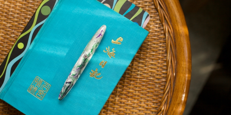
I rarely care about the package of a pen, but this time the packaging for the Future series is a must-see. Outside there is a well-executed cardboard sleeve that features a stamped gold background for the “Best Wishes” tagline, and inside there is a simple one-compartment box that holds not only a pen but also a bottle of Live in You black ink, with the help of three elastic bands. It is a fundamental way of packaging, but it impressed me anyway with its straightforward manner and harmonious color scheme.
As for the pens themselves, I ordered two models in my first order: one ice-pattern acrylic model, and one white-green-purple model in the resin (in Live in You’s material jargon). I would say both of them are the masterpiece of material engineering.
In the first look, the Future pens are featuring a spindle-like body that is almost seamless. Yes, I know it could get boring quickly to say it is another Balance-style pen, but please allow me to put it side by side with other well-known streamlined pens, and let the pictures speak themselves. The curved shape of the Future pens is bringing out the whole character of the material in a substantial dimension. The richly-carved body line resonates with the Moonman M2 I just reviewed, but the appearance is never leaning toward the flashy side of the spectrum. It is a body design that can convey a substantial existence easily.
Then in the case of each of these pens, things are even more intriguing.
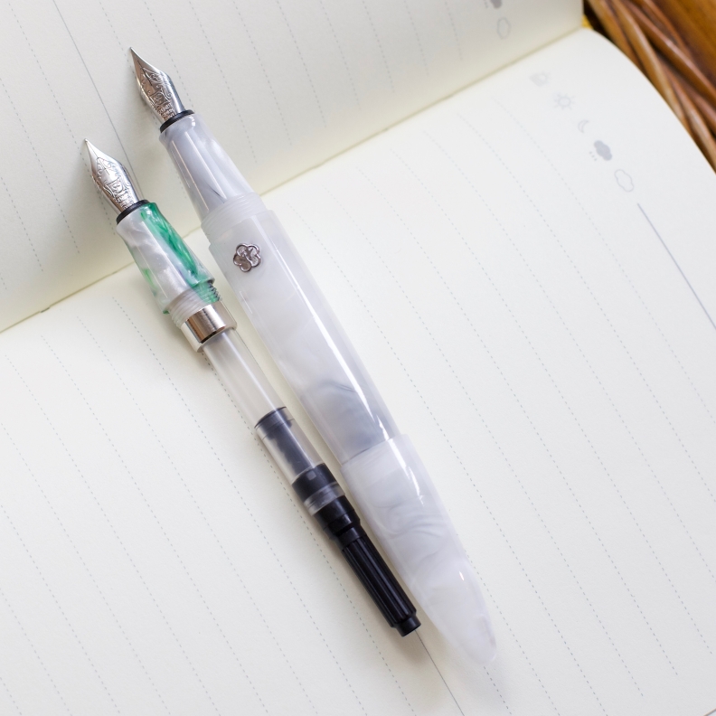
For the ice-pattern acrylic one, the nib is visible even from outside when the pen is capped, thanks to the stupendous thickness the cap, which feels like the feather in hand. From this thin layer of the veil, I can see the endpoint of the nib is almost touching the wall of the cap–the kind of extreme design I always expected from Eason.
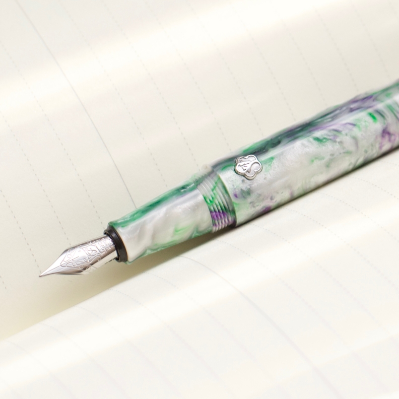
But the real deal for the Future line is the resin one. The delicacy of its material could easily surpass other acrylic pens in my collection. It is the first one to convince me that an acrylic pen could also be appreciated as an acrylic painting, thanks to its simple structure which results in an ever-expanding, edgeless canvas. The one I am reviewing depicts a picture of a vertical burst of violet purple and jade green colors from the top of a snowy main peak. This pattern transits from the cap and the nib section to the barrel area in a natural way. Eason cared about the integrity of the design and collaborated with the manufacturers here to make this possible.
Besides the looks, the texture of this so-called resin material used here is also unique. It gives out a textural feeling so intense and dense that instantly you can tell the difference. To grab this one is literally like touching a piece of an oil-damped turtle shell. Besides, unlike a standard acrylic bar, the surface of this resin is not seamless even after processing and polishing—it is scarcely porous on spots where the different colors intermingle and remix. I heard from Eason that this is an unavoidable flaw due to the physical characteristics of this new material, but I am still happy with the result of such imperfection. The number of holes is not overwhelming, the size of each hole is also nuanced enough to avoid catching dust, but the real gaining is a feeling that this a living thing, interacting with the outside world.
Then comes the metal medallion located behind the nib section. It is a silver badge, small and slightly raised. It is a Live in You’s antler-over-flower logo, well executed. The color of this badge is silver in each model in the Future line. Thus the company wisely to choose to use only silver Schmidt nib this time.
Talking about the business end of this pen (although I am quite happy with this silver F nib), I want to propose this time for the company. Since it is a design so impressive, this might be the time for the company to think about offering nibs that can bring surprises, something like a fude nib or stub nib. By the way, the nib unit could not be easily screwed out on my two Future pens, so be prepared to have some rubber band before nib swapping.
One thing did diverge from previous designs inside the pen: a heavy metal band was added to the back of the main thread, which makes the Future pen not an ideal candidate to be transformed into an eye-dropper filler. However, the real effect of this metal band is the fact that it brings down the center of gravity.
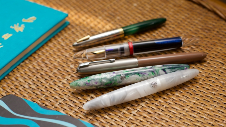
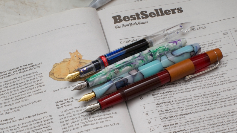
But that also brings me to the one real issue I am having with my Future pens: I don’t need my fountain pen to have a low gravity design. Sometimes it is just a standard procedure for mechanical pencils or gel-ink pens to have such a design, but it doesn’t make sense for a fountain pen to write like this. As we all know, the best part of writing with a fountain pen is to let the nib apply ink almost automatically to the paper without pushing down your hand. To maximize such pleasure, my taste is a body design whose weight is evenly distributed, so that I can let it naturally lying on my palm. Best examples? Parker 51 and Sailor 1911. But when the Future pens have two pieces of metal sitting around the nib section, it is just too much—I always found myself adjusting my writing position during the past week. In comparison, the three other #5 nib pens I am using (depicted in the following picture) have much better handling.
Another small issue is the sharp edge of the nib section caused by the step up there. By any means, it is not a tremendous step, something you can find on pens from BENU, and it should not cause too big a problem for me. But thanks to the previous issue of bad weight distribution, this sharp edge continually cuts into my thumb and index fingers whenever I reposition the pen. It could get quite annoying and distracting during a long writing session.
Without the weight issue, the Future pens easily checked every box for a brilliant fountain pen: a breathtaking visual that starts from the package, one rare body material or pattern, a reliable solution of the nib, feed and converter, and a legitimate brand. However, as I have put at the beginning of this review, I had been waiting too long for this model with other Live in You fans. Thus I wished I can enjoy this one as my daily workhorse when I finally got one. Then the weight issue breaks that high expectation. For a writing instrument so beautiful and well-sourced, I still really wish it to write a longer article rather than some short bullet notes. So, in the end, the Future series is a huge step up in the game of visual design, but still not the perfect Live in You pen yet.
Translation and Link:
- If you want to buy one from Taobao, be sure to inform the seller not to ship the ink that comes with the packaging.
-
- Live in You: 里莜
- Future: 未来
Gallery:


nice photos and great thoughts on the pen! I was super interested in getting one because it looks so pretty but I’m hesitant now because of some of the issues you mentioned. Would you say not worth the trouble?
LikeLike
Thanks for the honest review and photos. I was hoping to get the pen but didn’t think the shape of the section and the step-down will suit me. It’s still a promising and young brand, so let’s look forward to better designs in the near future. Really appreciate the interview you had with Eason too, as it gave me a greater appreciation of the brand and some of the processes behind pen manufacturing.
LikeLiked by 1 person
Hi. I heard that Schmidt nibs are crimped into their unit (cant pull the nib off my mitu pens). Does this mean that you cannot get a replacement nib for this pen?
LikeLiked by 1 person
For folks living in the U.S., the Future is available on Ebay as just the pen (not the set with the ink). “Live in You” is abbreviated as “LIY”, so if you search “LIY Future” or “LIY fountain pen” you can easily pull up the listings.
LikeLiked by 1 person
Hey Frank, have you seen the Fuliwen 017 series of pens? They look awfully similar to the LiY Future series in terms of colour choice and shape geometry.
LikeLike
Hello, of course, I have seen it. Actually, the nice folks from Fuliwen even sent me some of these to me last year. In hands, it is totally different from the Future series, and their quality cannot beat up to the level LiY achieved.
LikeLike