

I did not anticipate so much affection for this second member of the M-line Moonman pens.
My first take on the M2 went like this: “No matter how cool the red aluminum center band on the M2 looks, it may simply be a Lecai pen from last year reiterated in the M1’s shape.”
I was very wrong.
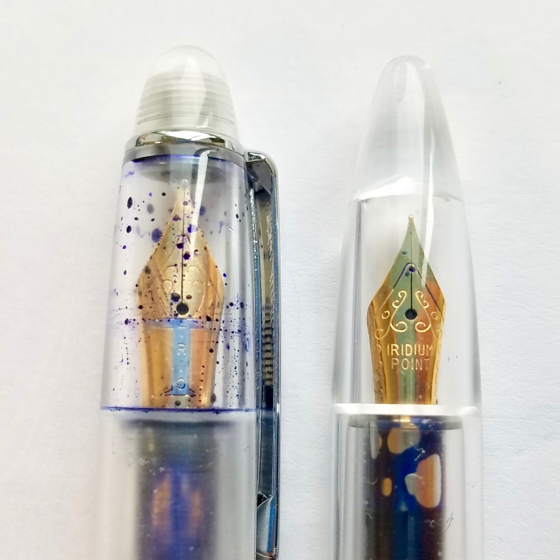
While I was still waiting for my M2 bought from Taobao seller, pen pals in the community who ordered from eBay had already begun to share with us their promising first dates with the new model. Initial Instagram un-box posts revealed an excellent looking eyedropper that writes tiny but not scratchy.
Then Chris finished his video review in which he compares it directly with the original Lecai and tests the feed with some crazily-wide stub nibs. Later in the same week, Joe, the Gentleman Stationer himself, set the M2 as the featured image for his trademark SUNDAY READING post and said it could be a “real find” for the price, the first time a Chinese product treated like this.
So I decided to take my M2 more seriously.
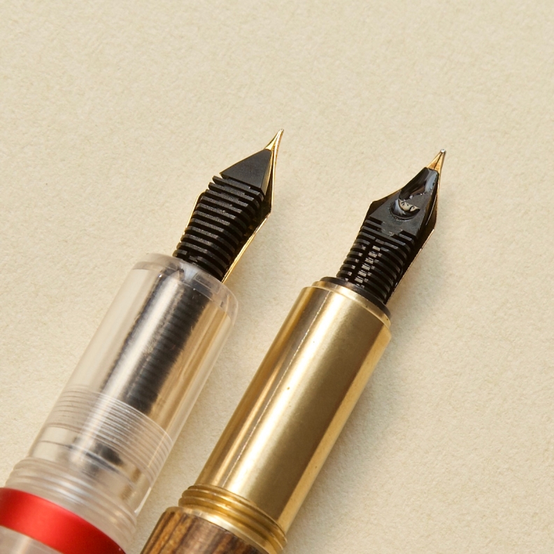
Shortly before the 2018 Baltimore Pen Show, I received it. I took a detailed look into the pen and shot a whole bunch of well-lighted studio photos as I usually do. The center band feels better than my anticipation, and the steel nib is exceptionally well-plated and stamped compared with its Chinese counterparts. However, I was still not persuaded.
Then I packed the pen into my pen case, headed to the pen show. Lisa from Vanness Pens told me she was interested in the newest development of Chinese manufacturers before, so I also packed pens from both modern and vintage era. Besides the all-time classic Hero-100 pens, there were one (Green) Wing Sung demonstrator, two PenBBS 308 demonstrators, and a Lorelei in my pen case. During my stay in Baltimore, I can tell the interest around the M2 is higher. Even hardened pen bloggers or sellers like Lisa Vanness and Brad Dowdy were in some way more impressed with the M2’s appearance when I laid down my collection. Lisa asked Mr. Vanness to come and joined us to see this one, and the Pen Addict himself only picked up the M2 from my pens—later he told me he likes this pen.
I was amazed and decided to spend more time writing and thinking with the M2. In the past weeks, I have been using the Moonman side by side with the Wing Sung 618, the Sailor Pro-color 500 and a Franklin-Christoph 45. I also took it to the monthly meet-up of the Big Apple Pen Club, where people’s reaction and opinions helped me a lot in defining the value perceived by western users more clearly.
A Lecai in M1’s shell?
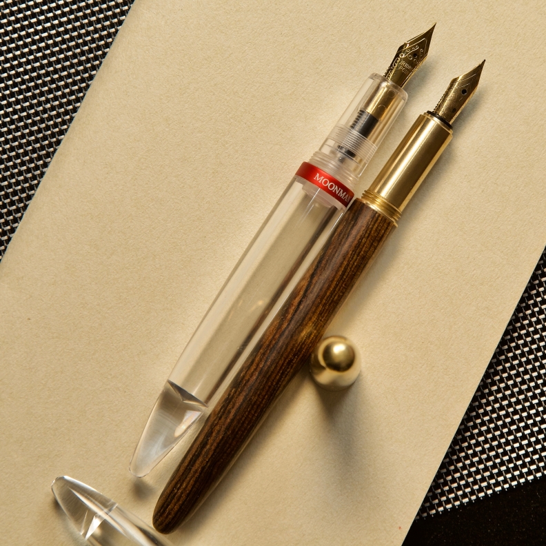
In a first glance, the outline of the M2 is very similar to M1’s, and its use of acrylic is the same as Lecai’s. But the actual pen is vastly different from both of them regarding looks and feels.
The central part of the M2 is chunkier than the M1, resulting in a more rounded and friendly curved body. Then the fact of being a transparent eyedropper makes it diverge from the direction of heading towards another Balance-like pen. But the effect of this clear acrylic body only pop-up when you put the pen into daily use, rather than an idle position under my studio lighting, un-inked.
The transparent curves contain various surfaces inside the pen that reflect and refract the ambient lighting, which could transform into surprises. For example, the moment you ink it up, the end finial lets the ink to reflex elegantly from the rear. Or, after a long writing session, the air you make into the ultra clear barrel reveals the lovely sheen of the ink. Finally, don’t forget places with changing lighting or screens, i.e., a busy trading room or a coffee shop in the dusk. These occasions can set a stage for the M2 to present its visual capabilities.
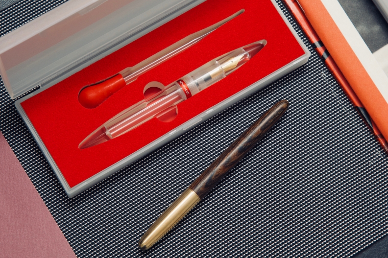
Then comes the red center band. I heard that not everyone is a fan of having a piece of metal setting right in the center of a bright chassis. Yes, it is an intrusive design that breaks the integrity of the texture if you want a seamless piece of plastic. But I still want to give credit to this band from a design thinking perspective—it does contribute to a cleaner look and feels for the pen, though using a different methodology.
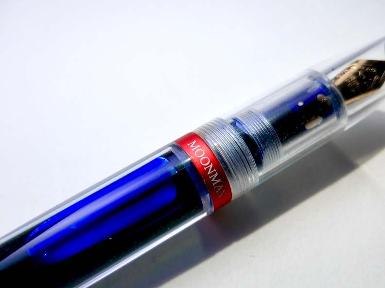
In the original Lecai, the inner of the cap is partly frosted so that all the threads and inky innards of the pen get covered under a white veil. The M2 abandoned this idea of a frosted cap or section, and its clear plastic parts do look messier than a Lecai in Chris’ video. However, same trick here for the M2—when you put this pen into daily shifts, the red center band does distract you a lot when you pick it up. Made of anodized aluminum, the band has a well-saturated redness, making it a better fit in a collection of outdoor gears or some electric gadgets. This band itself can conceal the central rubber ring set inside the main barrel. Then there is a white line of Moonman branding, all capped, proudly printed on the center of the band and strictly aligned with the surface of the nib. This blatant screaming out of the brand name is useless under the most critical lens of pen collectors, but it works well to grab eyeballs when you are writing with it, fingers covering part of the messy nib section. The practical effect of this design is not harmful at all.
Though a well-cooked idea, the one I got still falls short on details—from a particular angle, I can spot some glue left on the edge of this band.
A Real Find…For A Size 5 Needlepoint
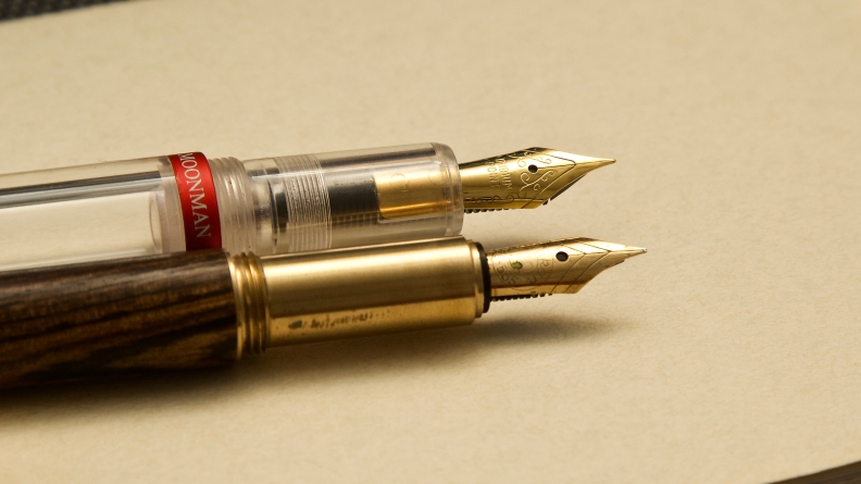
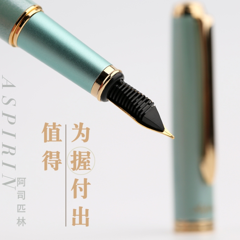
It is a good signal to see a new German feed in a Chinese pen since most of the feed makers are miles away from a comparable quality. But the M2 is probably not the first one to do that. Before this pen, Moonman showed us their accessibility to some #5 feeds through the Aspirin, a strange Pilot Cavalier homage pen that uses a NOS Chinese nib from the 90s. The company claimed the quality of these vintage nibs is above the normals, and the supply of them are limited. Judging from the listing page of the Aspirin, these nibs may write somewhere between F and M. Feedback from customers was right about these nibs, but nothing out of expectation, which I guess is what makes the nib of M2 go further. The tipping material for the EF nib has been aggressively ground, the stamping is sharp and clear, and the gold plating over the steel nib is trying to eclipsing all the other modern gold-plating Chinese nibs in looks.
I can almost reconstruct the chain of events related to the M2’s nib unit:
Somewhere in 2017, the folks that operate the Moonman fountain pen brand found they cannot get enough Jowo or Bock nibs for the several thousands of pieces of German feeds they purchased. They did scrap some compatible Chinese nibs from the vintage market, but that is not sustainable.
Thus, they had no choice but turning to nib makers in China, who habitually like to stroke the final products with a dubious “IPG”(Iridium Point Germany) stamp. Moonmen knew their market segment well. Thus they told the nib maker to get rid of such German gimmick this time and focus more on QC. As the lesson from Aspirin was learned, they gave more importance to make an EF needlepoint this time. So the nib vendor was told to make a good 0.38mm nib by the time.
I know this reconstruction is only 80% accurate, but now it is clear to me that this EF nib is the real game changer for M2.
In the night of the last monthly meeting of the Big Apple Pen Club, I found people there were raving about the fineness this nib can achieve without skipping, scratching or piercing the paper.
“Is this factory grinding?”
“Yes!”
“Impressive…”
Checking the internet, I saw similar appraise dedicated especially to the nib of the M2. People who love writing tiny prefer this EF nib, since it writes much smaller than their anticipation, and the feedback from the business end is not overwhelmingly scratchy—better than certain Japanese EF nibs.
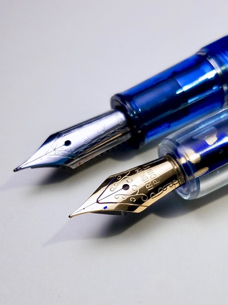
If you are familiar with Chinese pens, you must know that writing tiny bits of strokes isn’t an entirely new idea, and M2 apparently is not the first one fitted with a non-hooded EF nib that impresses. From last year, we have been seeing Delike producing 0.38 mm nibs for M1, Newmoon, and most of the Wing Sung pens offer an EF choice. Even companies that counterfeit or copycat LAMYs had managed to impress me with an EF nib that writes far better than a LAMY’s one. But somehow, I can say with confidence that at the moment only the M2’s needlepoint stands out, and the reason does not solely lie on the beautiful factory grinding, but also for the whole package around this needlepoint.
Firstly it should thank the standard size-5 German feed. This arrangement was first materialized by Moonman Aspirin, but it is not until the M2 that we finally see a modern Chinese nib tailored for this western standard part. In my experience, a typical Chinese needlepoint has the propensity to write drier and slower than a western F nib, due to the factory’s adjustment to make it write Chinese characters. The problem arises when you apply this nib to a western cursive writing style, and that’s where the German feed used in the M2 helps— a proper delivery channel for the ink to flow accordingly. Either drawing a long fast sketch line or taking note in margins, the feed can always give out the exact amount of ink needed. In extreme condition such as being shaken around in a commuter’s bag, this feed could offer quite a buffer zone preventing the ink from spitting out. My observation here could be summarized in this following picture:
Secondly, it is an excellent Chinese nib in itself. The IPG nibs used in mainstream Chinese pen brands have always been horrible. Lots of Fuliwen products, for example, got degraded by these IPG nibs. And remember the bad first experience with IPG nib maker in my last interview with the founder of Live in You? Eason was freaking out by the IPG nibs he bought and swears never use Chinese nib again. For all the nitty-gritty of the IPG nibs, a reading for Brian Gray’s opinion would be informative enough. With all that said, what happened to this IP nib in M2 could only be attributed to an exception. I don’t know yet who made this nib, but whoever made it must have worked it out in a hard way—this nib has the same build quality as a sailor steel nib. If one day they got the stamping pattern right, it could be a real stunner.
Thus zoom out, when the originality of the body works finally encompasses all the advantages of this nib unit, the whole package is ready to glory.
(Sadly, after the M2, Moonman showed us the Wancai, a Helico knockoff. Hope in the future Moonman could iterate more in the direction of M2. )
Translation:
-
- Moonman M2: 末匠 M2
- Wancai: 丸彩
- Wing Sung: 永生
- Lorelei: 水妖
- PenBBS: 中国钢笔论坛

Alright! You’ve convinced me to give it a go, even though I fall into the group that does not like the red band. A commendable EF needlepoint? How could I resist!
LikeLike
Well I’ve got one of these beauties on their way to me, but I can’t find anyone anywhere yet who has addressed this question: How does that gigantic M2 eyedropper well start to behave when it gets down to about only 1/3 full? Burping? Leaking? Gushing? I certainly hope I don’t have to find out from experience how low the fill level needs to get before it needs to get refilled to avoid a disaster, so any insight would be appreciated.
LikeLiked by 1 person
I am back! I will try to work it out tonight.
LikeLike
Hi Frank, any news on this research re lower fill levels in the M2? How has your experience with the pen been longer term?
LikeLike